

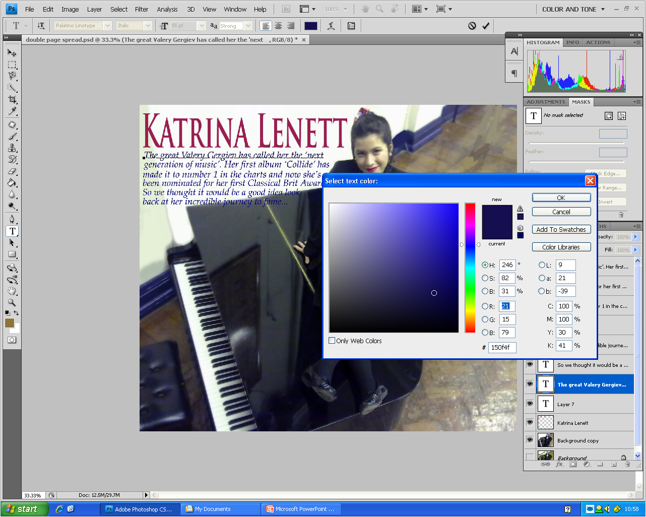
I started to experiment with the colours to see which colour I wanted for the title of my double page spread. I decided to go for a plum colour as I thought it matched with the models lipcolour and headband. I went for a formal elegant font for the titile.

 Here I have started to create the fact box for my double page spread. I used the 'text box' tool to create a rectangular box in the corner in which I was going to put about 5 facts. I also made the colour of the fact box a gradient colour between black and a purply/plum colour so it went with the theme and added a bit of colour. I chose the writing to be white as it would stand out on the dark background. Afew finishing touches I included are the page numbers and the person who wrote the article, in this case the editor of Perfect Harmony magazine. I choose the Editor to be the writer as I thought that a proffessional and well known person like the editor writing the article would make the reader think that the article is very important and interseting.
No comments:
Post a Comment